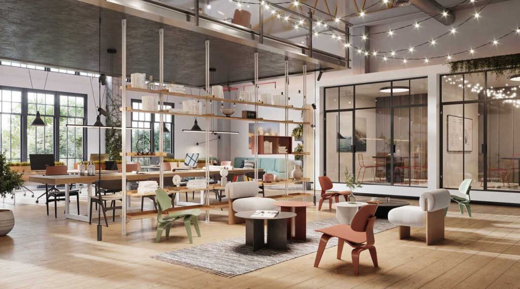
Here’s what makes Facebook’s HQ design and workplace so attractive


We’re always fascinated by what some of the most innovative companies in the world are doing with their offices. After all, businesses that push the envelope when it comes to design are often the ones leading innovation in their industries.One of those companies — and the one that most often comes to mind when you think of groundbreaking office spaces — is Facebook. Designed by renowned architect Frank Gehry, Facebook’s new building reflects the core values of the company, mirroring Facebook’s forward-thinking attitude in many of its features. For those eager to take a peek inside, here’s what you’d find.
1. A workplace nestled in an urban environment

The original Facebook headquarters were spread throughout downtown Menlo Park, and the recent upgrade maintains a similar vibe. The new campus integrates urban elements into its overall design, creating a community rather than just a workplace.
For instance, Facebook’s new office — first announced in 2012 — includes two cafes, a burrito bar, a pizza window, a sit-down restaurant and several different kitchens. It even has its very own coffee shop! This helps to cultivate an environment of collaboration and comfort that extends well beyond the desk.
2. Balance between openness and focus

Facebook’s new campus, which spans 430,000 square feet, contains one of the largest open office settings in the world. Even CEO Mark Zuckerberg himself sits at one of the plain white desks that dot the floor. This collaborative atmosphere helps to foster creativity and camaraderie because no one feels like another employee is receiving special treatment.
Of course, not everyone can focus in an open office all the time. If you need to isolate yourself and truly get down to work, the site offers a number of conference and private rooms to help you focus. This unique blend offers the best of both worlds, and helps to cater to every style of worker.
3. Art incorporated into workplace culture

Facebook lives and breathes creativity, but this can be hard to recognize since the company’s work takes place online. In order to showcase physical manifestations of creativity, they’ve started an artist-in-residence program. Works by local artists have introduced little touches of visual inspiration throughout the office setting.
Employees can also contribute their own art, too, by creating messages and designs on blank walls. This personal touch cultivates a community of self-expression.
4. Design with a purpose
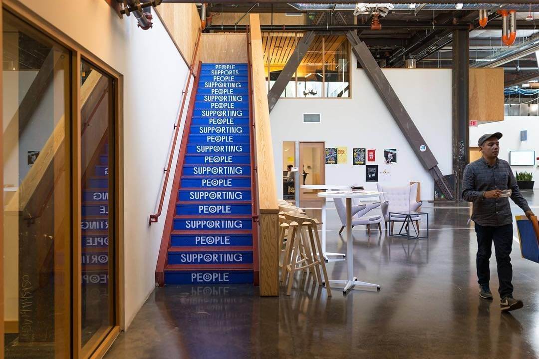
Every aspect of Facebook’s office design is intentional. For example, there are large windows that flood the entire office with natural light.
This isn’t just for show — natural light is one of the many things that improve worker happiness.
Their open office setting mimics the changing nature of their company by maintaining a fluid and informal design. Upper management sits side-by-side with the rest of the staff, which flips the traditional “corner office” mentality on its head. This arrangement encourages everyone to voice their opinions.
And Facebook’s main lobby area includes elements like exposed concrete and dangling wiring, all of which evoke memories of the scrappy little startup that Facebook once was.
Need some office layout tricks for an impressive lobby or reception area? Find them here.
5. Health treated as a priority

The Menlo Park office features a rooftop garden where you can forget about the work day and get some fresh air. It also has a track that circles the rooftop garden, which can be used for walking meetings.
Continuing this focus on health and movement, Facebook offers their employees adjustable desks so that they can stand while working. The office even has showers for those who decide to ride their bikes to work. Their new building truly infuses health and wellness into the workplace.
For a facility manager, it can be helpful to take notes from companies that are revolutionizing the traditional office setting. Facebook combines urban inspiration, creative artwork, intentional design as well as a focus on health to create an innovative, open office. How can you apply these ideas to your own office?
Photo Credit: Mark Zuckerberg, zitagao, Mark Zuckerberg, Toby Harriman, facebooklife, Toby Harriman


